Job seeking for a fulfilling role is a process with many pain points, but many solutions already exist for various parts of the process. We identified an unmet need in the market being that job seekers needed a more efficient way to tailor their resume for multiple positions and gain insights into how their resumes were perceived by potential employers.
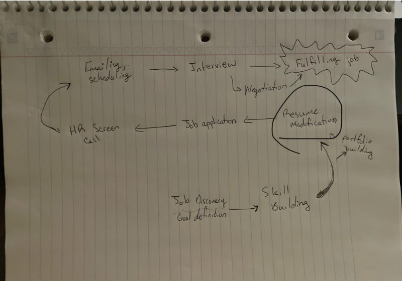
After meticulously designing user pathways to optimize navigation and interaction, our team developed detailed mockups for each page. This approach allowed users to interact with the product in a natural, realistic manner. We then conducted extensive user interviews, which were instrumental in identifying friction points and areas of confusion. These sessions also highlighted features that users found most valuable. This feedback was crucial for refining the user experience, ensuring the final product was both intuitive and aligned with user needs. Below are some figures showing screenshots from the early mockup pages.
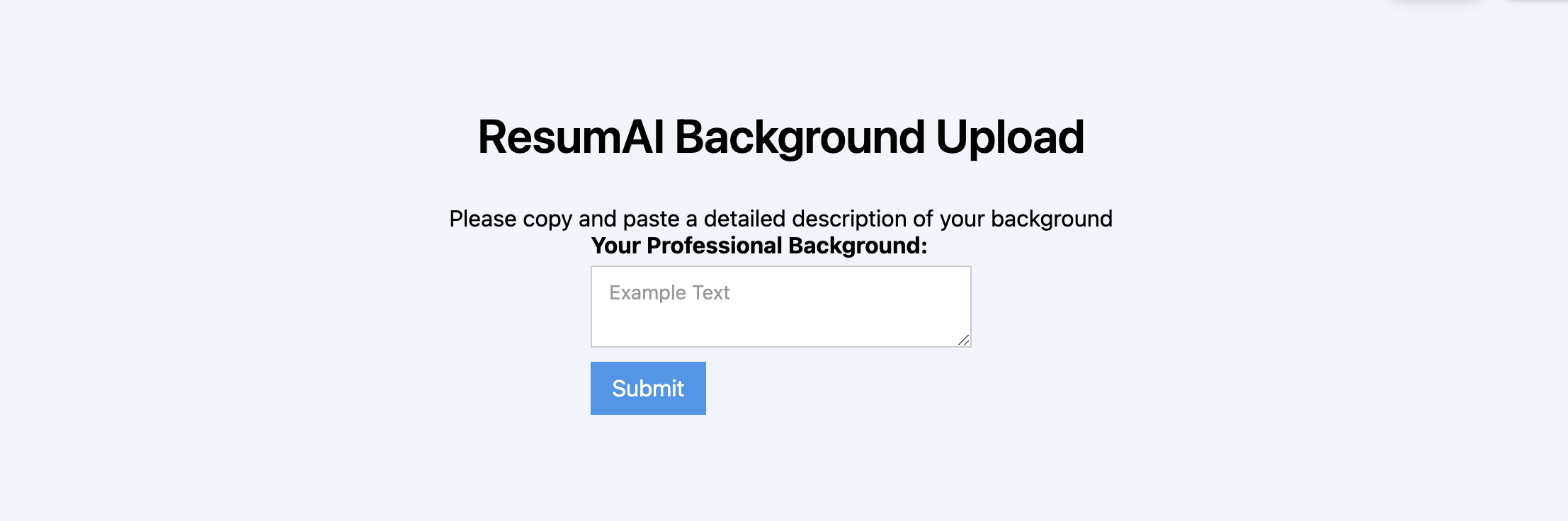
Before moving further down the design and development pipeline, we wanted to test our core hypothesis. After our study of 15 user interviews we discovered that users did find value in the idea, but didn’t readily have a professional summary with detail about their experience beyond a resume, and were not willing to create one due to the effort involved.
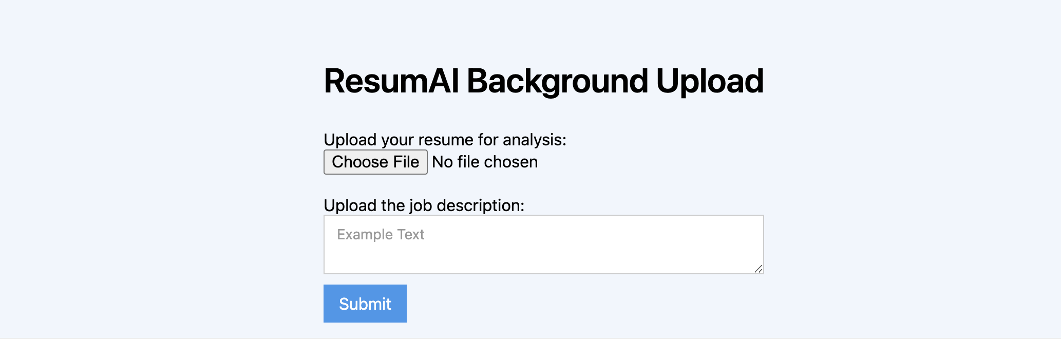
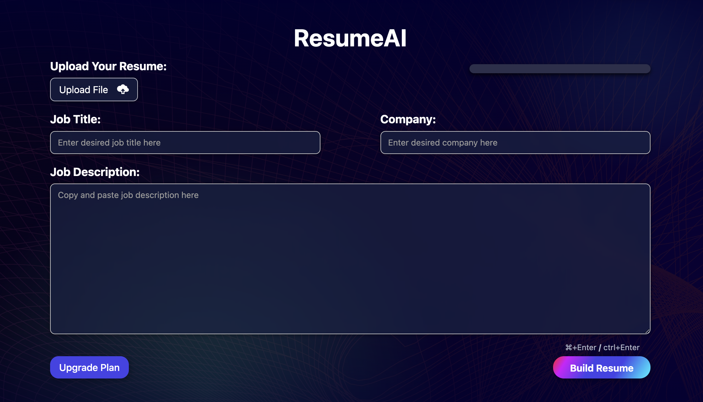
Draft 2 for user testing. We simplified the process for the user by including a file upload button for their resume, and a text input to upload the job description for keyword matching in the backend.
Introduced a user-friendly dark mode theme specifically designed to minimize eye strain for users engaged in lengthy job application sessions.
Enhanced backend personalization features were also developed to include both job title and company name, enabling tailored resume adjustments that better align with individual applications and employer expectations.
After the successful initial release of our product, we identified an opportunity to further enhance user success by deepening resume personalization. Our team developed a sophisticated new feature that dynamically generates or refines a mission statement for each user. This tailored statement is specifically crafted to align with the job title and company the user is targeting, providing a highly customized and compelling introduction that enhances their application. This feature not only strengthened user profiles but also significantly improved their chances of standing out in competitive job markets.
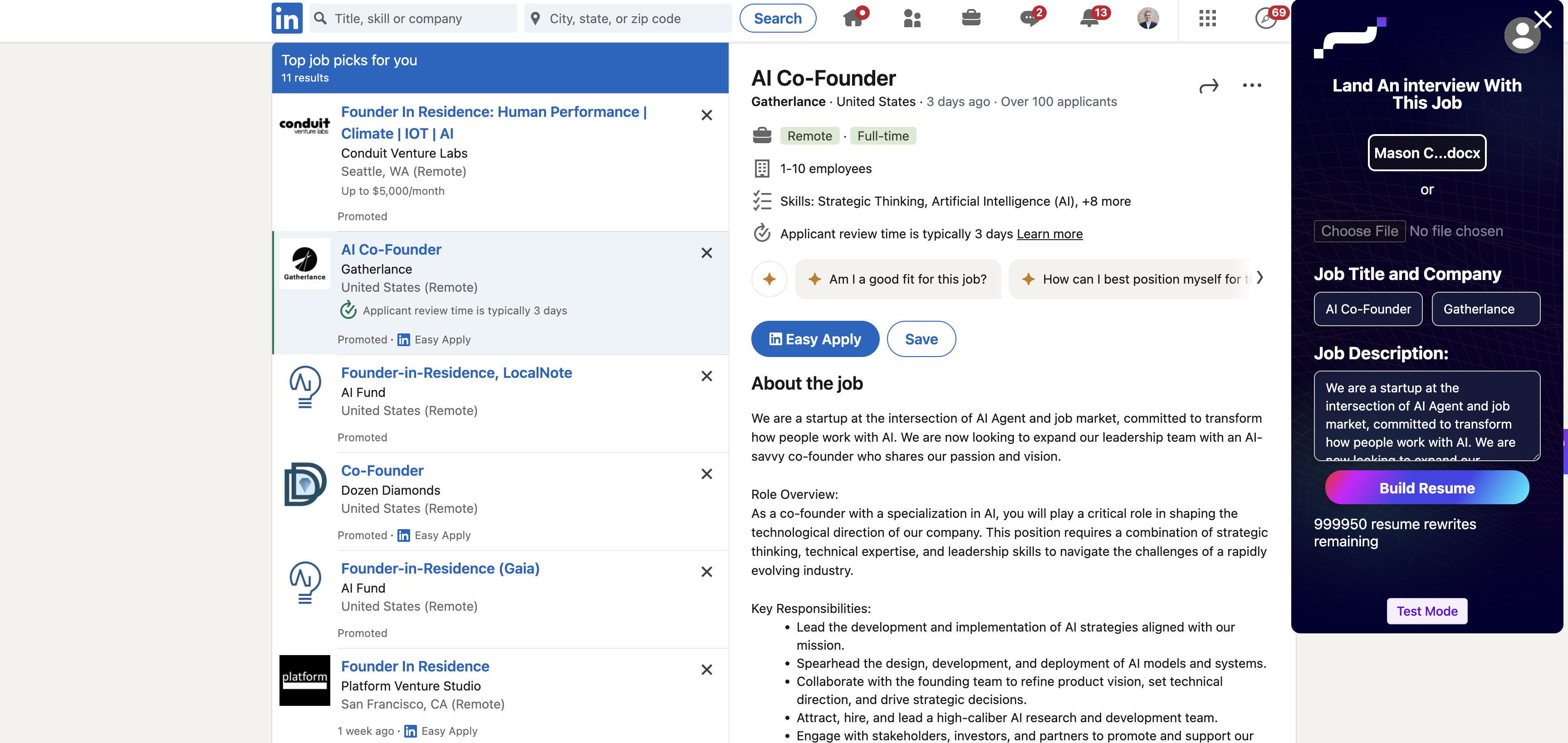
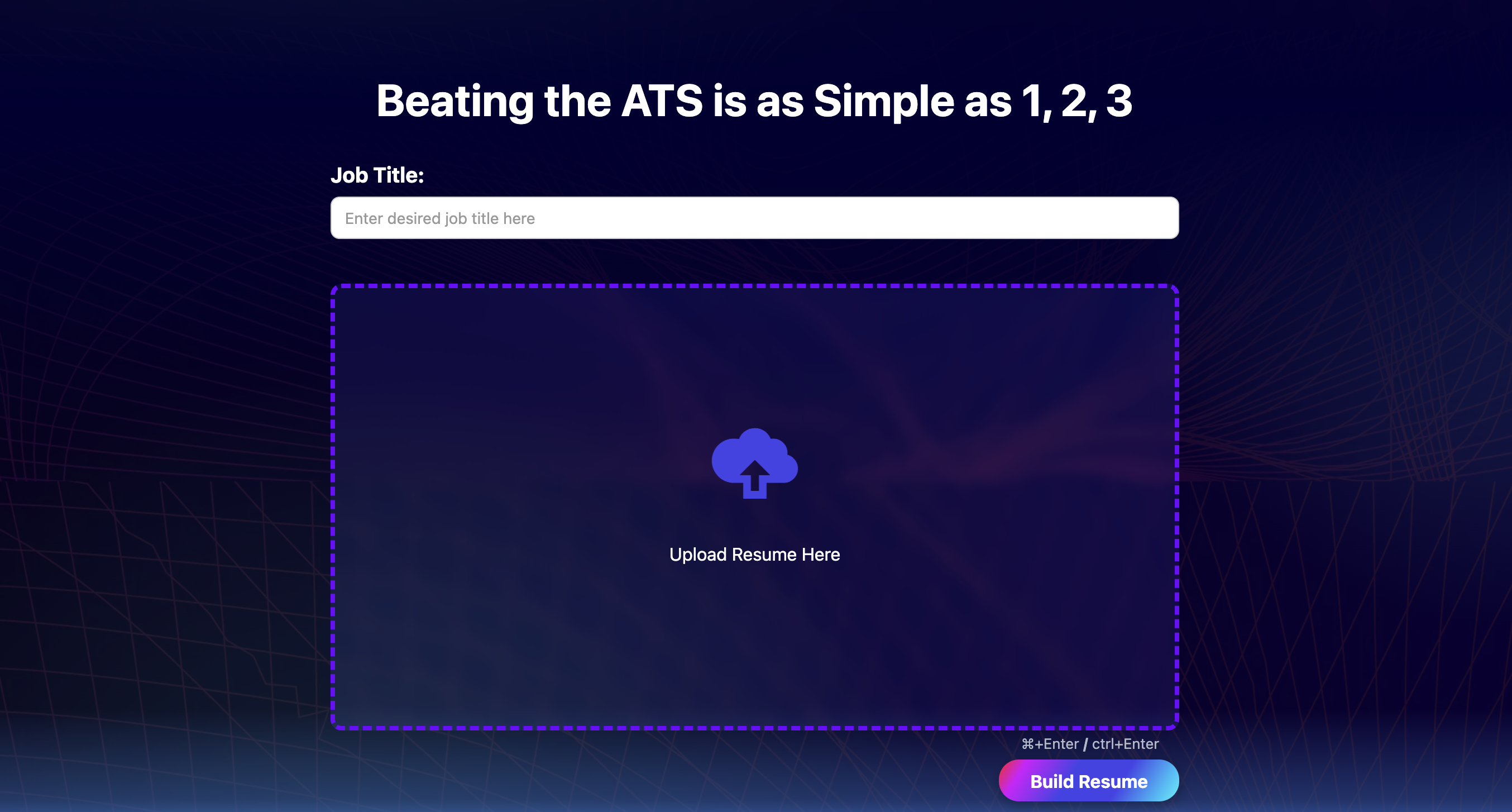
After seeing significant success in product usage after signup, I led the design of the UX and user flow for usage of the product prior to user login, enabling lower user friction and higher sunk cost, increasing product usage and signups. This screenshot is from the landing page, just under the hero section.
The team has been working on expanding the product to a chrome extension, which requires consolidating components and designing a more minimalistic design due to the reduced space, and even more efficient workflow being taken by the user. Some changes or additions to the core product that we made were:
- Automatic scraping of the information required for the form, reducing user action required and time spent per application
- More minimalist design, removing the resume score and preview
- Simplified success page with call-to-action focusing on moving to the next application quickly